If you’ve ever looked at a stock trading platform or financial news channel, you’ve probably seen a chart filled with colorful, vertical bars called candlesticks. These aren’t just random decorations—they’re powerful tools for traders to analyze stock movements and make informed decisions. But what exactly are candlestick charts, and how can you use them to improve your trading game? Let’s dive into the world of candlesticks and explore their secrets!
Table of Contents
1. What is a Candlestick Chart?
A candlestick chart refers to that chart through which a trader shows the price movements of a given stock, commodity, or currency over a given timeframe. Unlike simple line charts connecting the closing prices, candlestick charts provide more detailed information; for each period, they show the opening price, closing price, high price, and low price.
Each ‘candlestick’ on the chart represents a given time frame, which can be one minute, one hour, one day, or even a week. The body of the candlestick would then depict the open and close price range, whereas the thin lines, also called wicks or shadows, outline the high and low prices the stock has reached within that period.
2. Breaking Down a Candlestick
To understand a candlestick chart, you need to know what each part of the candlestick represents:
A. Body: The wide part of the candlestick is called the body. It shows the difference between the opening and closing prices. If the closing price is higher than the opening price, the body is usually colored green or white for the trend to be treated as bullish or upward. In case the closing price happens to be lower than the opening price, the body is usually colored red or black for the trend to be treated as bearish or downward.
B. The Wick: The little lines that project above and below the body are also called wicks or shadows. The very tip of the upper wick represents the high price reached during the period, and the bottom of the lower wick represents the low.
C. Open and Close: The open price is the point from where the stock started trading during the period, while the close price is where it finished. On a bullish candlestick, the close price is above the open price. On the other hand, in a bearish candlestick, the close price is below the open price.
In this case, with the combination of both body and wicks, one is able to grasp any short-term sentiment of the market.
Read More:- What is Options Trading – Definition, Types and Strategies
3. Common Candlestick Patterns
Now that we know what a candlestick is, let’s talk about patterns. Candlestick patterns are the distinctive formation formed by one or multiple candlesticks that are believed to predict future price movements. Below are some of the common patterns.
A. Doji: When the opening and closing prices are approximately equal, this candlestick forms a real body that is very short with long wicks. A Doji is an indecisive market. After a long white or black candlestick, a Doji suggests that the previous forces of supply and demand are becoming more evenly balanced.
B. Hammer: This is a very bullish pattern found at the end of a downtrend. It normally has a small body with a long lower wick; it means that during the period, the stock traded a lot lower and came back to close near its opening price. This pattern usually indicates that the buyers are just starting to gain control of things.
C. Shooting Star: This is the opposite of the hammer. This is a bearish pattern that comes at the end of an uptrend. It looks like a small body with a long upper wick, meaning the stock made another high but could not hold onto those gains. It’s a possible reversal.
D. Engulfing Patterns: An Engulfing Pattern is formed when a small stick is immediately followed by a much larger one, this larger one completely engulfs the previous one. In the case of a Bullish Engulfing Pattern, a small red stick is followed by a large green one; then it initiates its true reversal action to the upside. A bearish engulfing pattern has a small green candlestick followed by a large red one that would indicate a potential move down.
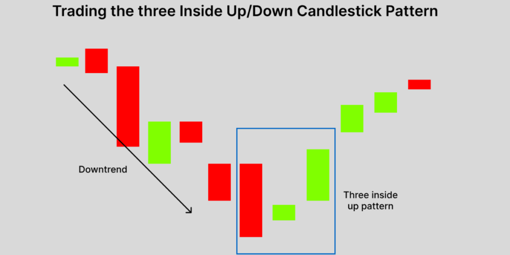
E. Evening Star and Morning Star: These are reversal three-candlestick patterns. A morning star must be at the end of a downtrend and is made of a big bearish candlestick followed by a small one, either bullish or bearish. In the end, it should be followed by a big bullish candlestick. The evening star is the opposite and normally occurs at the end of an uptrend.
4. How Traders Use Candlestick Charts

Traders use candlestick charts in a variety of ways. Here are some of the most common ways to do so:
A. Identify Trends: It is really quite easy to identify the trend of the market through a candlestick chart. By looking at a series of candlesticks, you can quickly see whether the market is in an uptrend, downtrend, or moving sideways.
B. Identifying Reversals: Reversals are what most traders identify in candlestick patterns to find the probable trend reversals in the market. The Doji, hammer, and engulfing patterns might give an indication that the current trend is losing its strength and a reversal could be on its way.
C. Confirmation signals: Most of the candlestick patterns are combined with other technical indicators in order to confirm a trading signal. That means a moving average crossover or an RSI indicator had been used together with the candlestick pattern in order to confirm a trade setup.
D. Setting Entry and Exit Points: Traders use candlesticks to establish entry and exit points of a trade. For example, once the bullish engulfing pattern has been determined, a trader may choose to go long, placing a stop-loss order just below the low of the pattern to keep risk low.
Read More:- How to Use The Most successful options strategy in India
Conclusion
It is much more than pretty patterns; it is a major tool to help traders make the right decisions by understanding the psychology of the market. Learning to read candlestick charts and being able to identify the common patterns provide valuable insights into market movements and a better way of bettering a trading strategy.
Keep in mind that this is not to say you can’t glean a lot from candlestick charts. It is just that they should not be used in isolation. Remember, it is about using them in conjunction with other forms of analysis, and following risk management always. Happy trading!
Frequently Asked Questions
Q. How do I read a candlestick?
Ans. The body shows the range between the opening and closing prices, while the wicks indicate the highest and lowest prices. Green/white bodies symbolize a bullish move in which the close is higher, while red/black bodies symbolize a bearish move with the close being lower.
Q. What do the colors of candlesticks mean?
Ans. Green or white means a rise, while red or black color indicates a fall.
Q. What are some common candlestick patterns?
Ans. The Doji for indecision, the Hammer for bullish reversal, the Shooting Star for bearish reversal, the Engulfing Patterns for a potential reversal, and the Morning/Evening Star for reversals, among several common patterns.
Q. Can candlestick charts be used for all markets?
Ans. Yes, candlestick charts can be used in different markets: stocks, commodities, forex, and cryptocurrencies.